

-
Lunar X is a digital-first media company that develops popular online series into globally-loved franchises. Having built their business in stealth mode for a year, they commissioned a brand identity and voice for the company's international launch as a public-facing entity. Brand architecture, visual language, tone-of-voice and messaging were created from scratch, then quickly applied to a nascent comms ecosystem. Guidelines were also created to ensure the brand's appearance remains consistent while the business continues to evolve.
Systemised formats:
- Brand strategy: proposition, purpose, mission, vision, values
- Brand identity: word-mark, logo
- Visual language: typography, colour palette, photography
- Tone of voice principles
- Business culture principles
- Key messaging for investors / creators / consumers
- Brand Bible: strategy, toolkit, guidelines
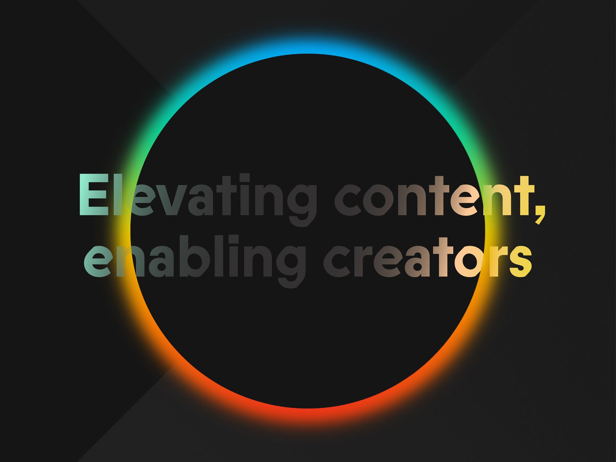
Lunar X Logo

Characters from the Lunar X portfolio incorporated into the Lunar X Halo
Billboard concept ad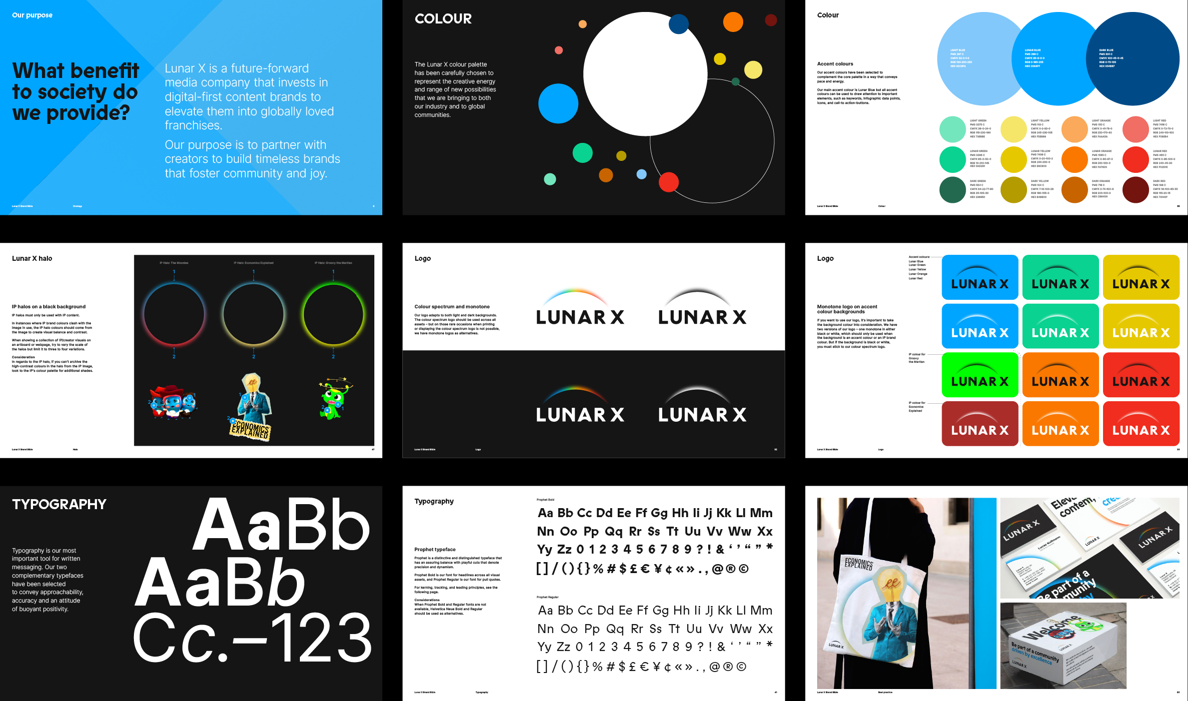
Collection of pages from the Lunar X guidelines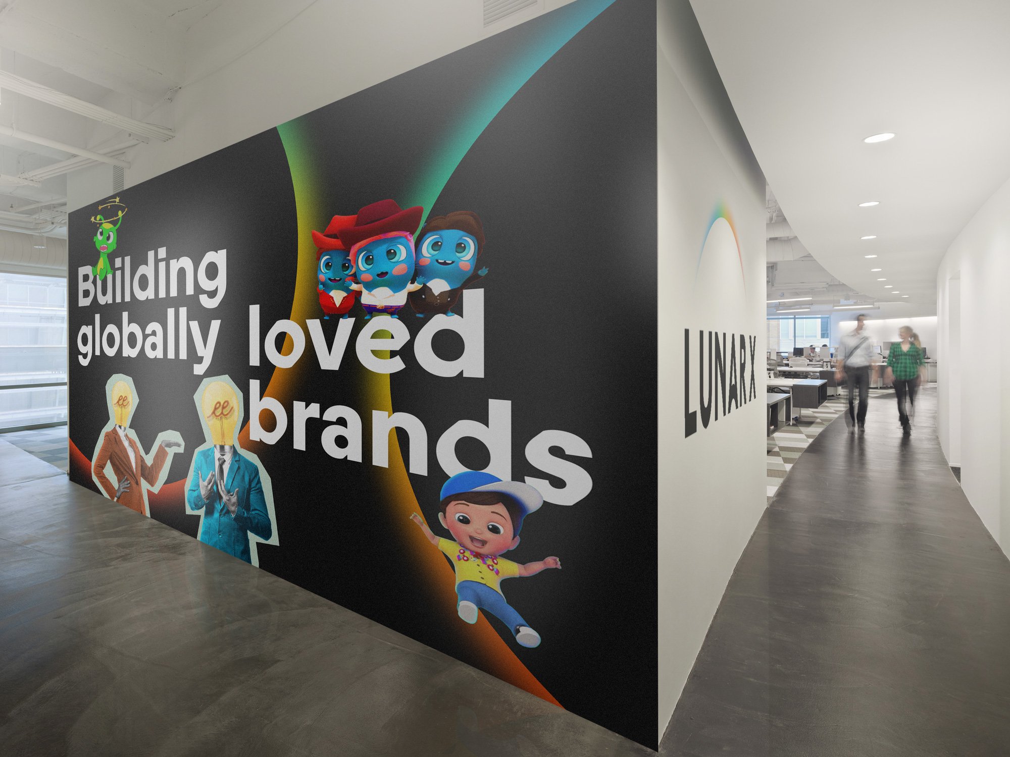
Office murals
Series of A0 posters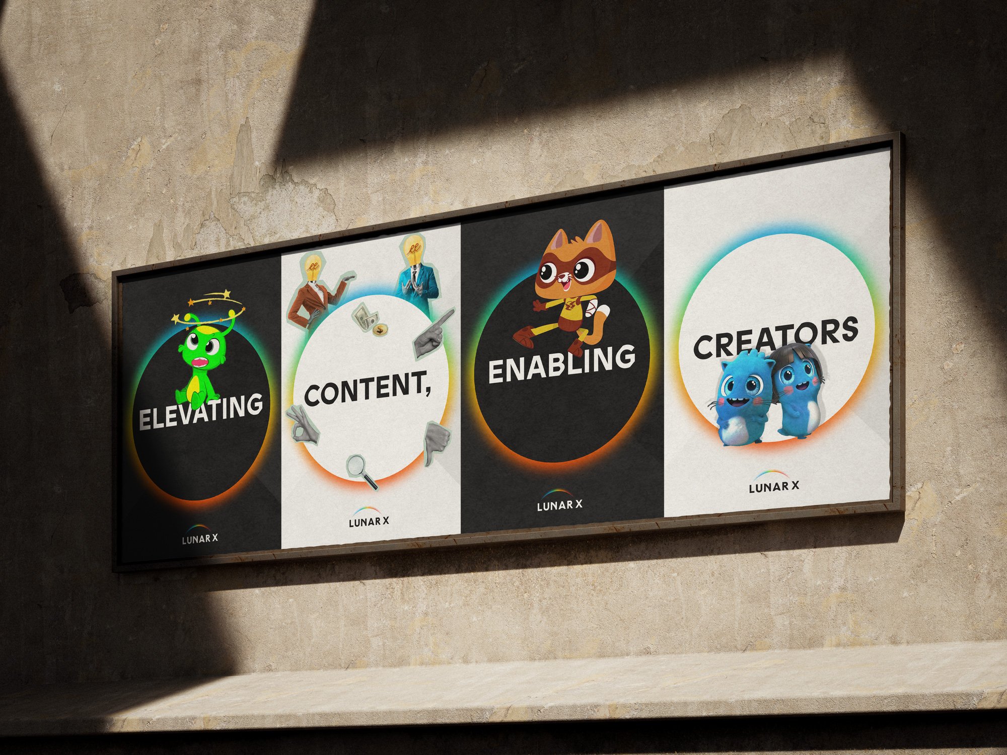
Series of A0 posters working together
A reception welcome mural graphic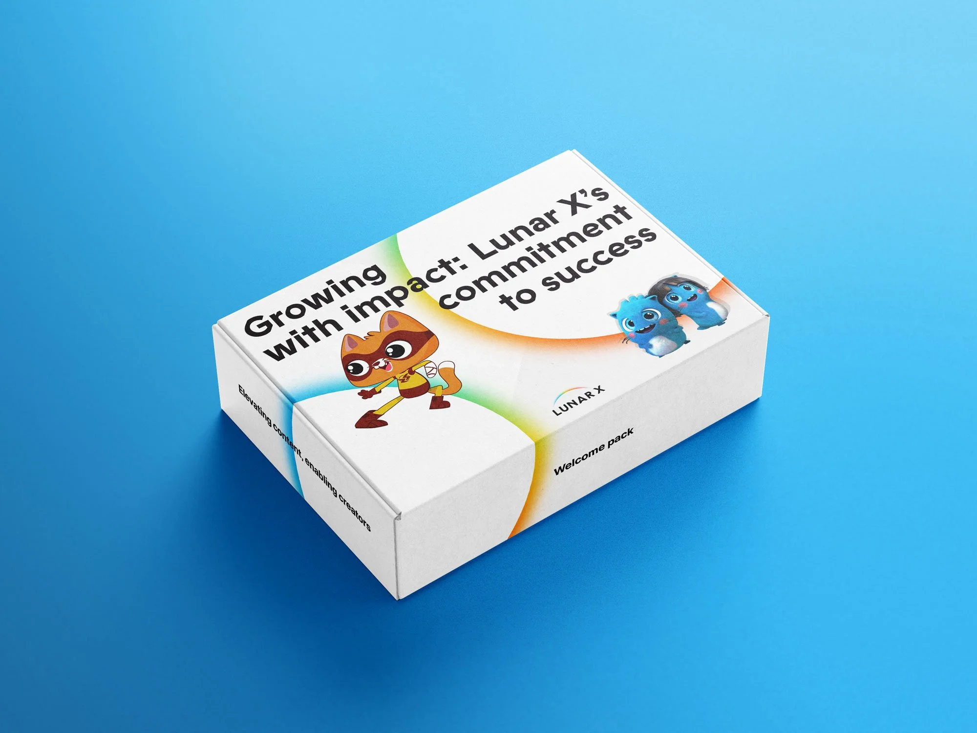

A Lunar X Welcome pack-
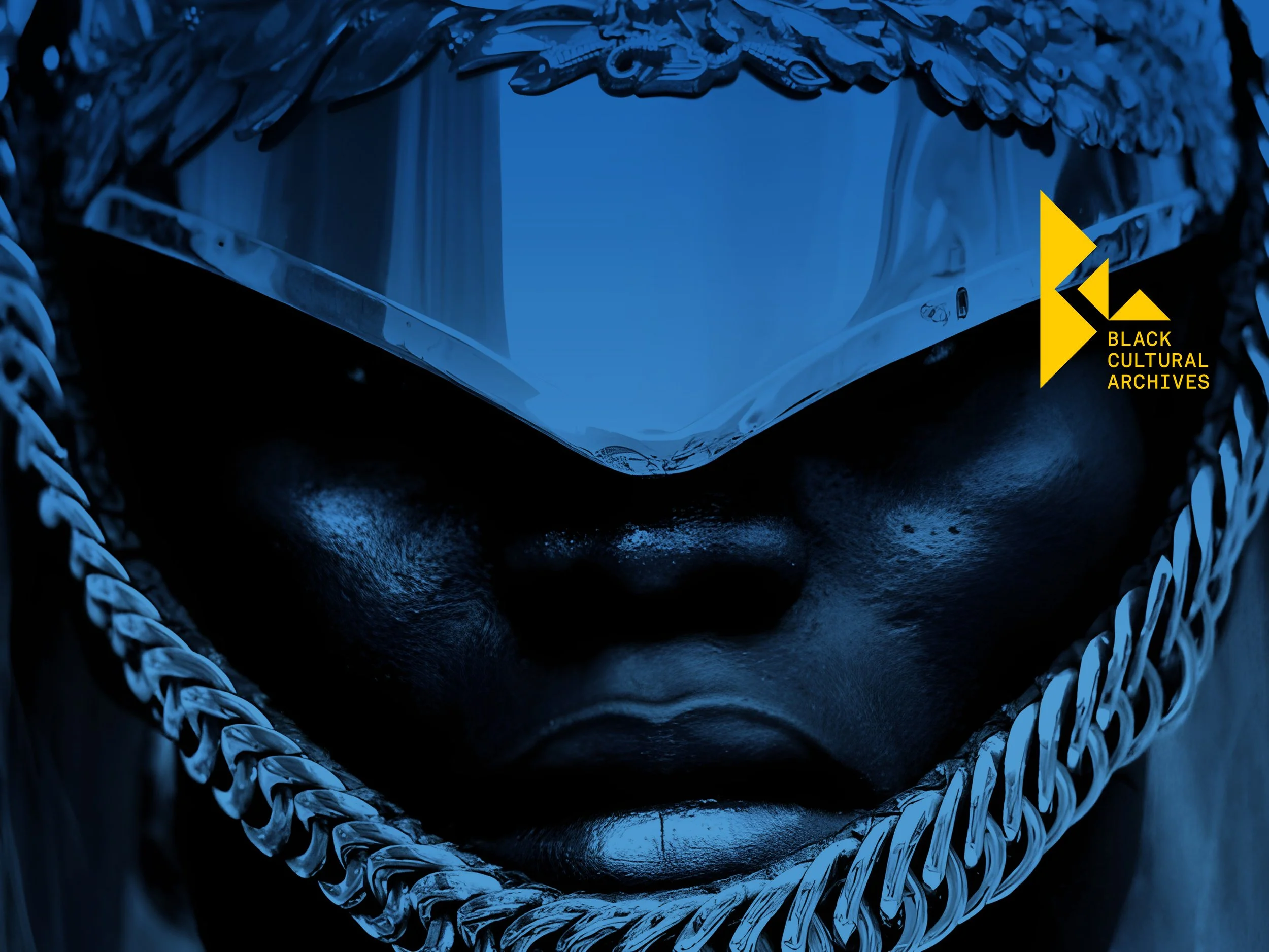
To mark its transition from a local archive of historical artefacts, to a national museum and iconic home of Black British history, the BCA commissioned a refresh and expansion of their presence in the public realm. We redesigned their brand identity, developed an impactful visual language, and codified a new public-facing tone of voice. We then applied these new design principles across print, digital and environmental channels - signalling a joyous and inclusive invitation to the British public.
Signalling formats:
- Brand identity refresh
- Brand design toolkit and guidelines
- Tone of voice principles
- Launch poster series (print & digital)
- Gift shop merchandise (various items)
- Wayfinding signage (indoor decals)
- Environmental signage (outdoor banners)

Key messaging highlighting BCA new directionEvolution of the BCA logo into a unified form
The BCA Logo in different colour-ways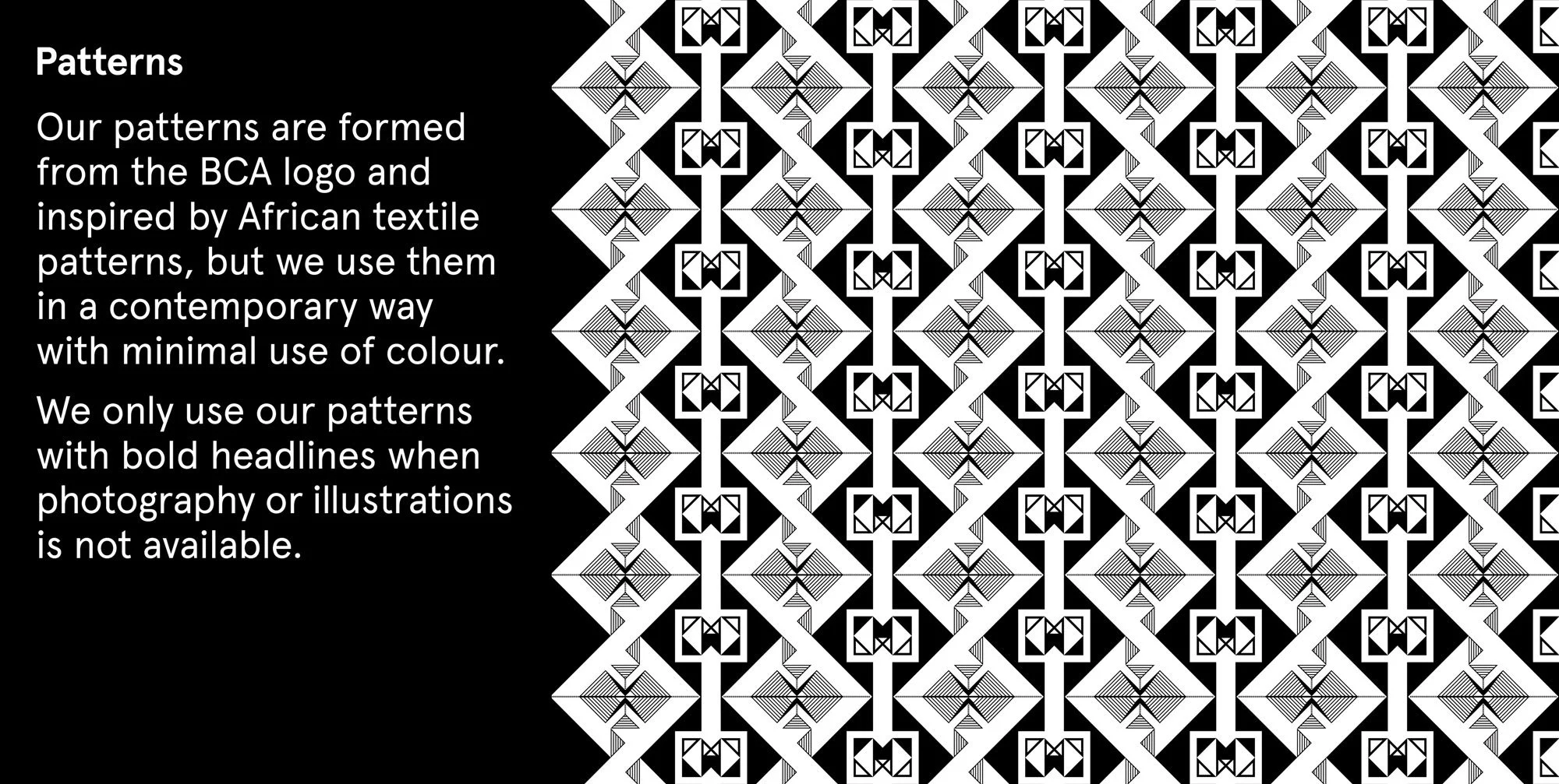
Introduction to the pattern section of the guidelines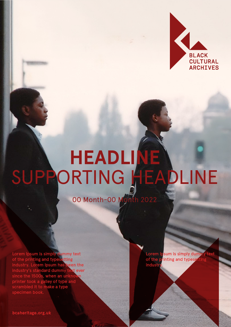


A series of brochure covers for the BCA Summer Youth programme 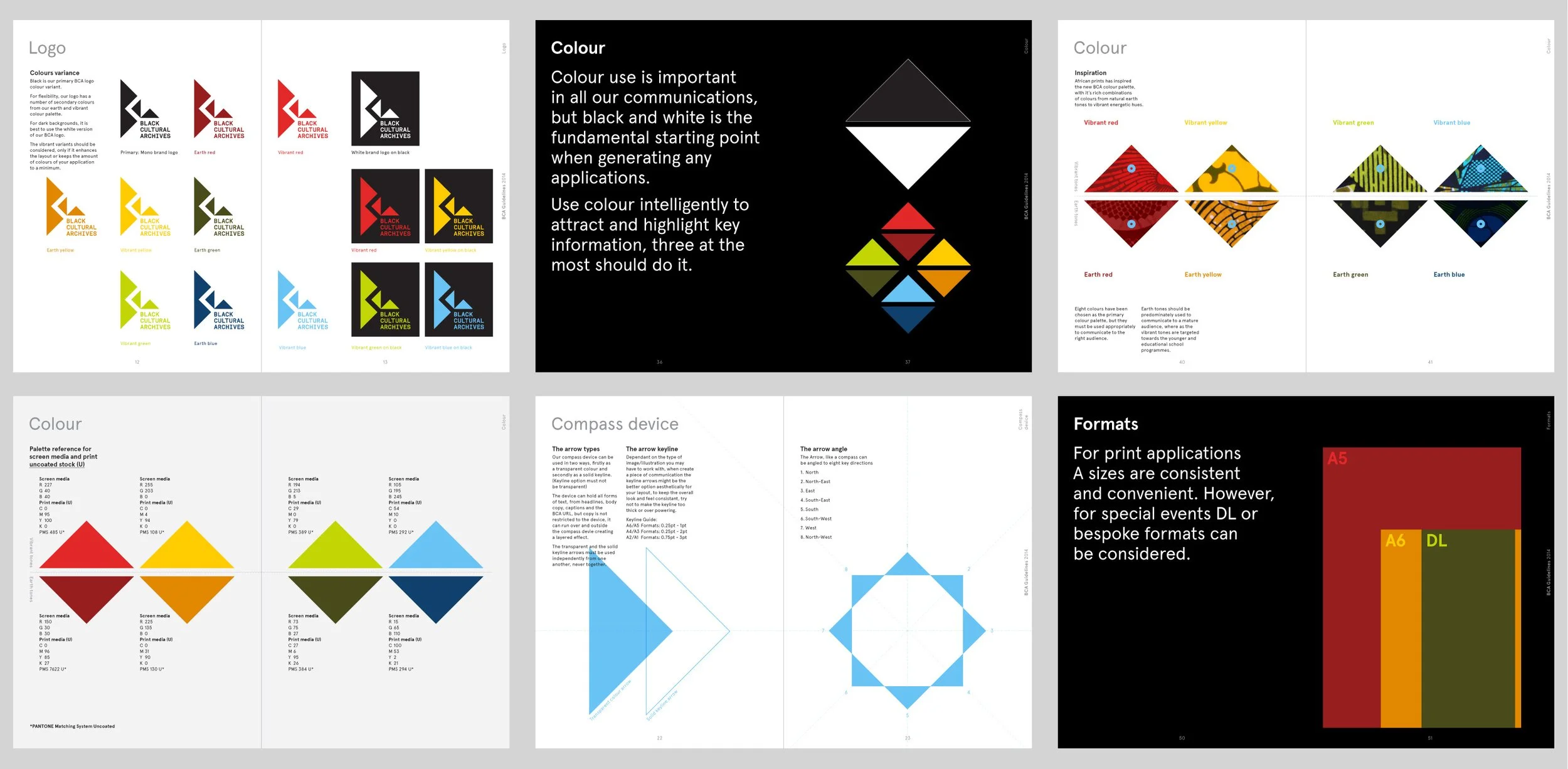
Collection of pages from the BCA guidelinesTemplate examples of poster series using dummy text


BCA's Courtyard, Reception, Café and Merchandise
Series of ad posters for the London Underground-
Spokehub is an international collective of thinkers and makers, founded by Onika in 2013. As a creative way to share news and spotlight members, we produced an editorial series on the theme of art as knowledge and Berlin as school. Seven studio visits and interviews were recorded, and themes that connected these creatives’ influences and aspirations, were shared monthly as an alphabetised mailer series.
Storytelling formats:
- Video interviews
- Long-form articles by Cameron Cook
- Poster artwork by Juliana Toro
- Editorial mailer

“ Berlin has space for following ideas and letting thoughts process... if you don't have a stomach then things just go straight through, so Berlin is like a giant stomach for me. Sounds a little gross but that's also a good thing”.
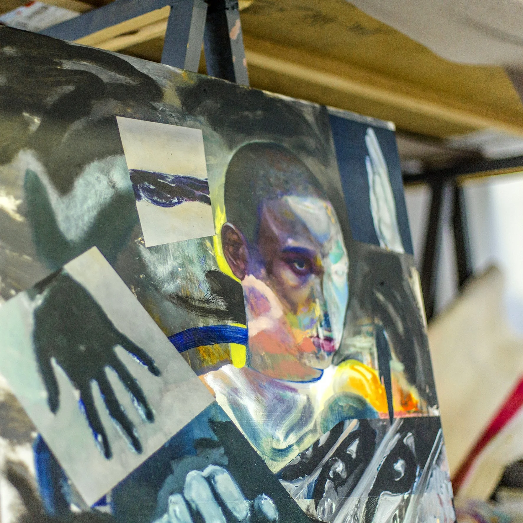
Work in progress • Winston Chmielinski studio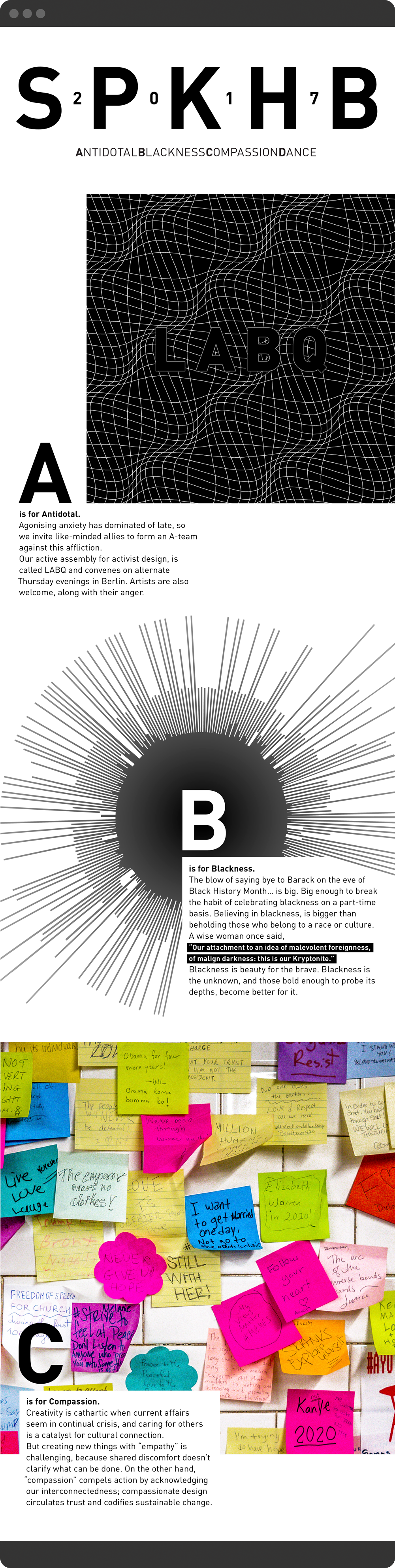


LABQ activism event series in Berlin.
“ I think it's time to start a new society... I don't want to go to a farm and plant my own potatoes, so not a parallel society, but more like a perpendicular society. This would mean using existing infrastructure and tools to come up with new scenarios and new language and new ways of living together”.


Class in session at the School of Machines, Making, and Make-Believe.


“ Music is conversations between individuals, creating something much bigger. I'm not very clear on specific new works but the overall opus is clear”.

Multi-media art performance by Satch Hoyt.

-
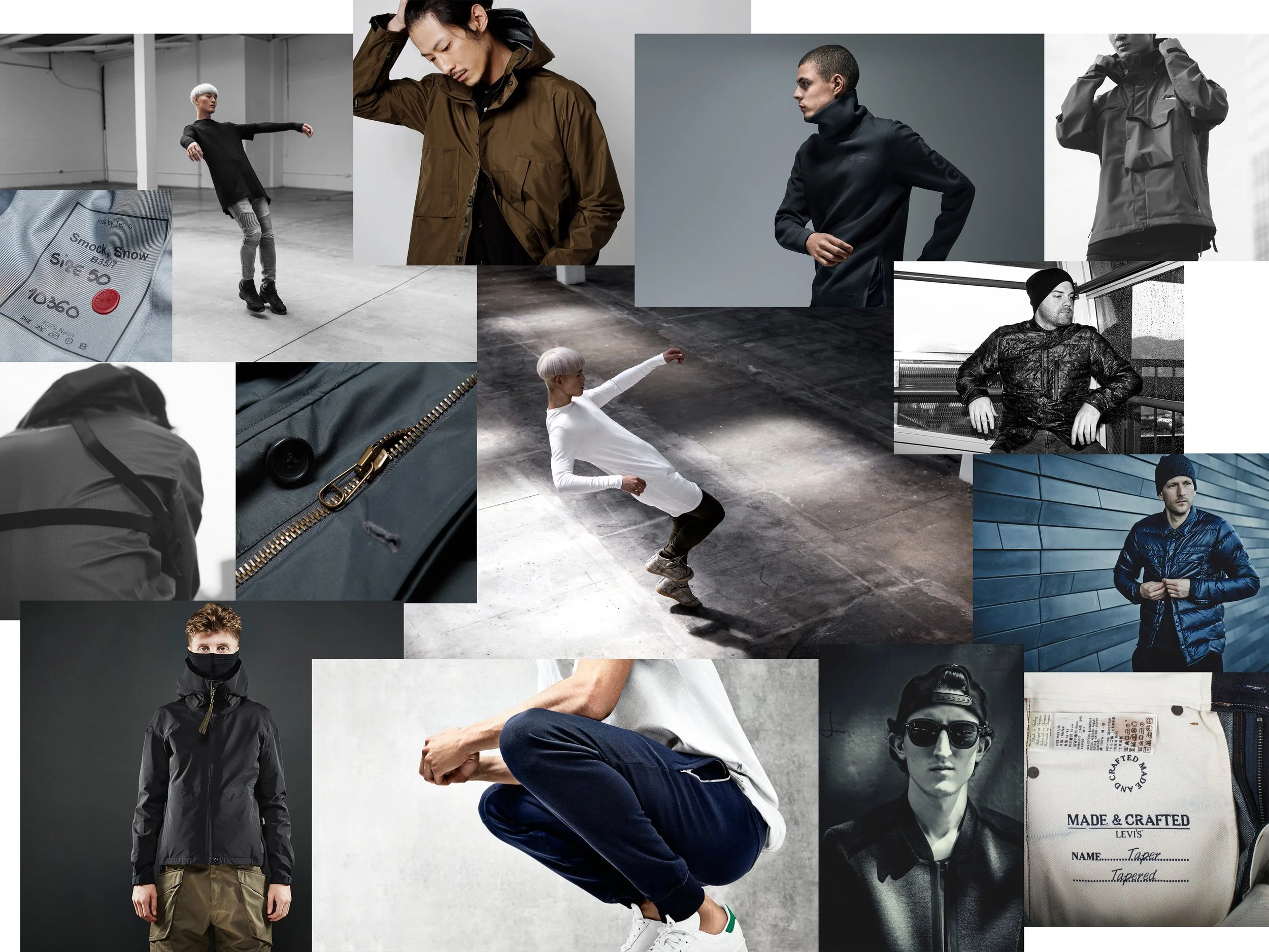
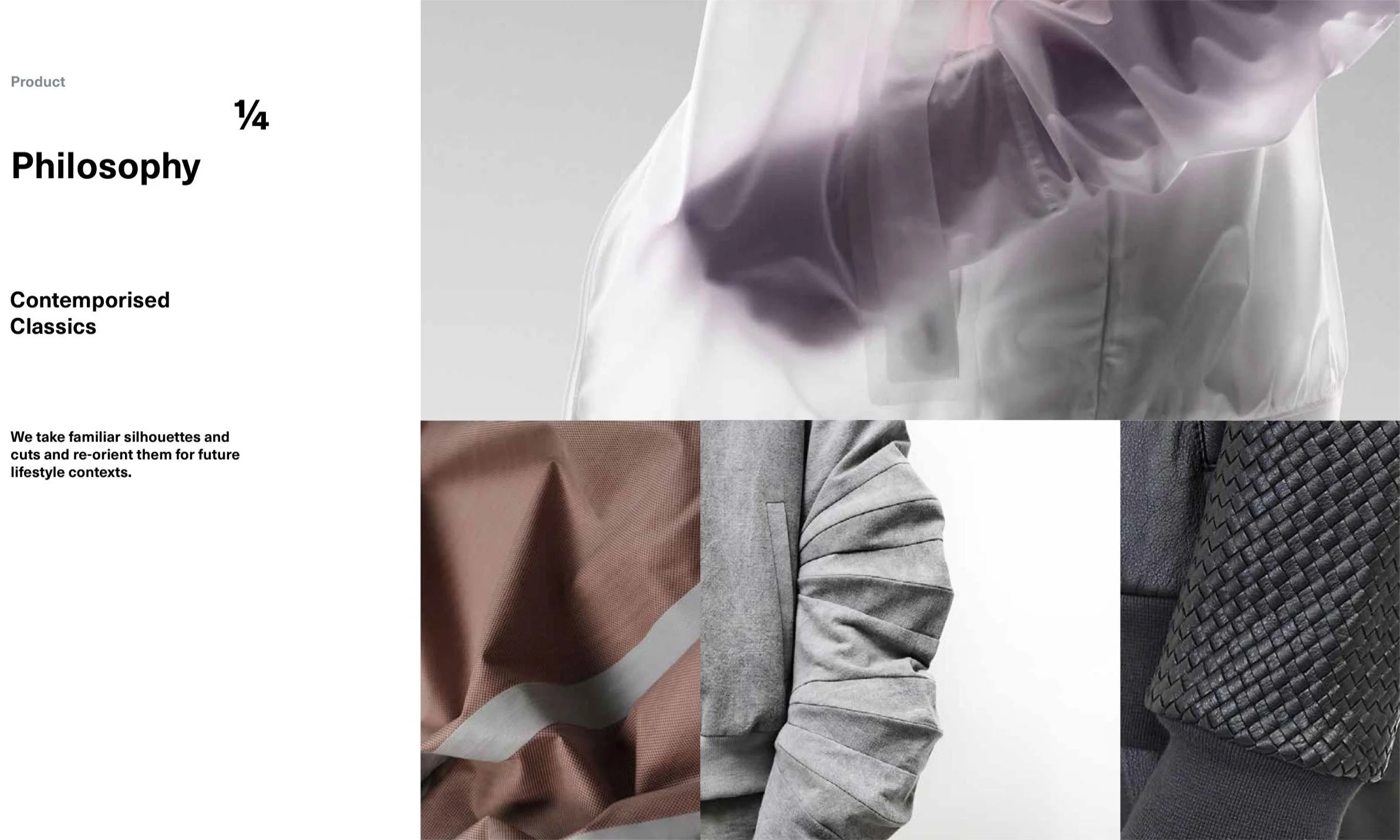
To guide development of a new apparel sub-brand, we combined aspirational themes, relevant trends, competitive benchmarks and technical garment design details. The product design and brand management teams used these inputs for ideation before brand and messaging development - then also later as reference points for assessing the finished proposition and designs.
Stimuli formats:
- Audience profiling
- Concept mood boards
- Competitive benchmarks
- Product design trends
- Marketing strategy concept

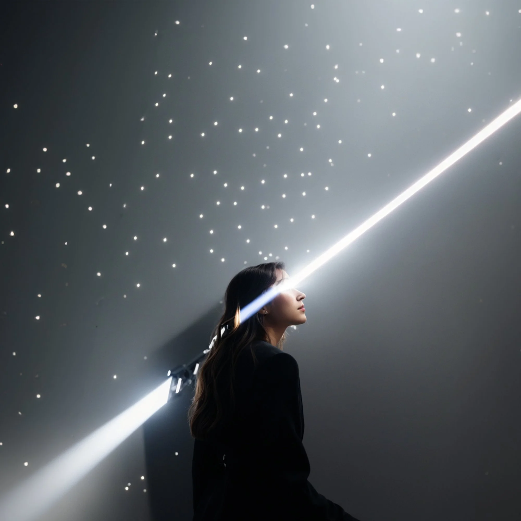
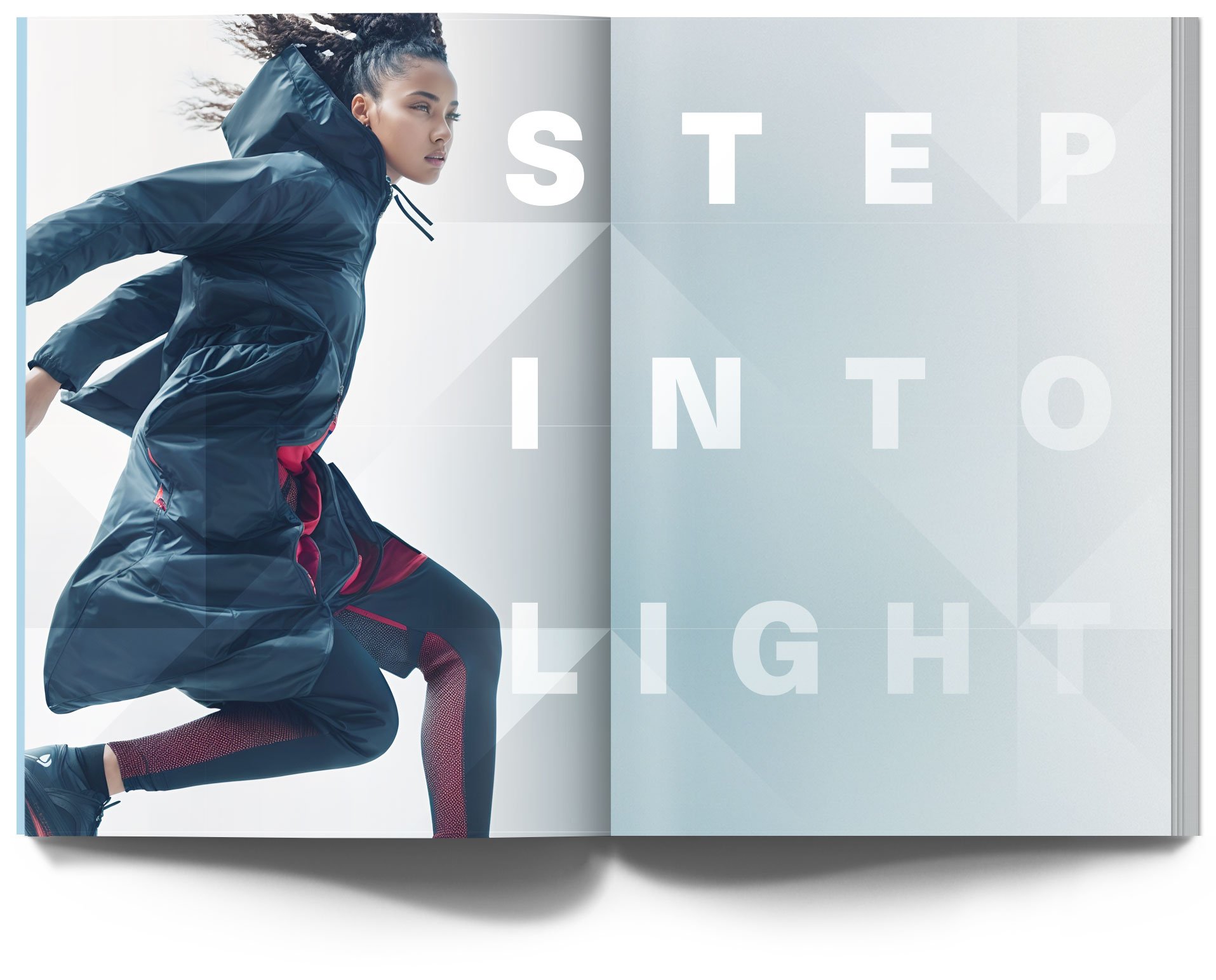
The brightest star in the Taurus constellation is an interstellar energy source, denoted by an intriguing red glow in the night sky.


Light is our expression of energy becoming creativity. It projects, reflects, and refracts - always illuminating new directions.
This collection is an invitation to ‘step into light’ and embrace limitless potential.


Launch like fashion
An immersive invitation to step into light
Focused on the emotional connection.
Singular call to action that will attract and intrigue.
Seamless connections to e-commerce via all media channels.
Forward with a promise of something new and illuminating.
Update like tech
A steady feed of product news to stay in step
Focused on new product features and inspirations.
Singular call to action for fashion and tech mavens.
Seamless connections to retail and events around the globe.
Forward with a promise to share progress in real time.
